Anatomy of a Brand
Reshaping Perception through Design

When the Rockbridge Area Relief Association approached a milestone year, leadership recognized a gap: the community knew RARA as a food pantry, but not as the region’s most comprehensive emergency assistance organization. The task wasn’t to redesign a logo. It was to reshape perception.
Founded in 1972, RARA serves Rockbridge County and surrounding communities by addressing hunger, housing instability, and financial emergencies. Yet public awareness centered almost exclusively on the pantry. The brand needed to: preserve community trust, expand understanding of services, reflect dignity and compassion, support both clients and donors. This was more than cosmetic - RARA needed strategic repositioning.
We anchored the identity in RARA’s stated beliefs.
Everyone deserves nutritious food and safe shelter
Everyone deserves kindness and dignity
Community interdependence is essential
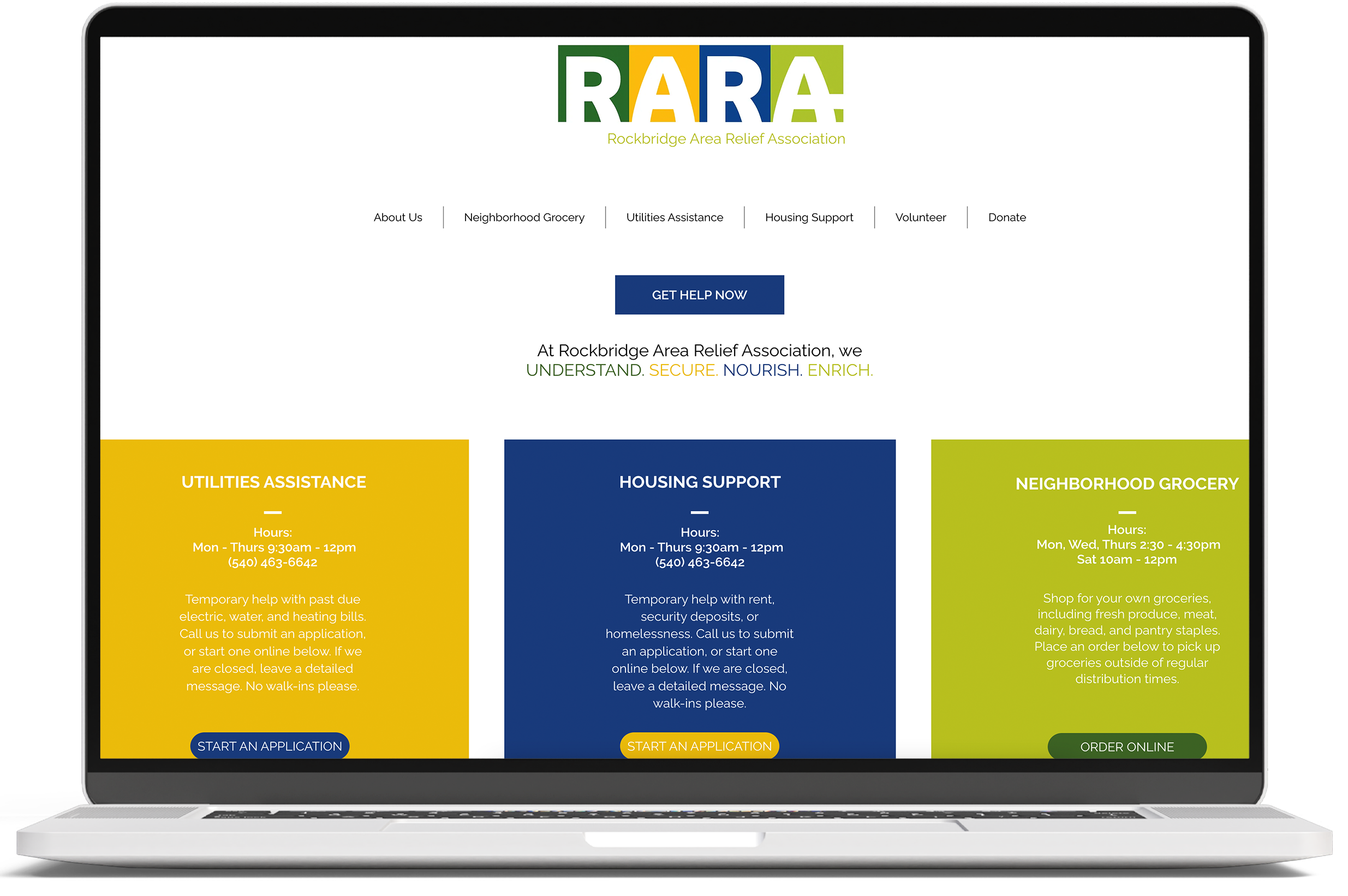
The logo system was intentionally modular. Four colored blocks frame the wordmark representing the multi-faceted nature of RARA’s services. Each color carries meaning:
Blue: Stability, trust, reassurance
Green: Growth, health, generosity
Yellow: Hope, optimism
Lime: Community and confidence
The tone framework was defined as:
Friendly, Welcoming, Inclusive, Compassionate, and Reassuring
We translated this into:
Plainspoken headlines
Clear service descriptions
Donor-facing transparency
Client-centered language


The architecture reinforced the message: RARA is more than one program. Rather than a single static mark, the system allowed services to stand independently:
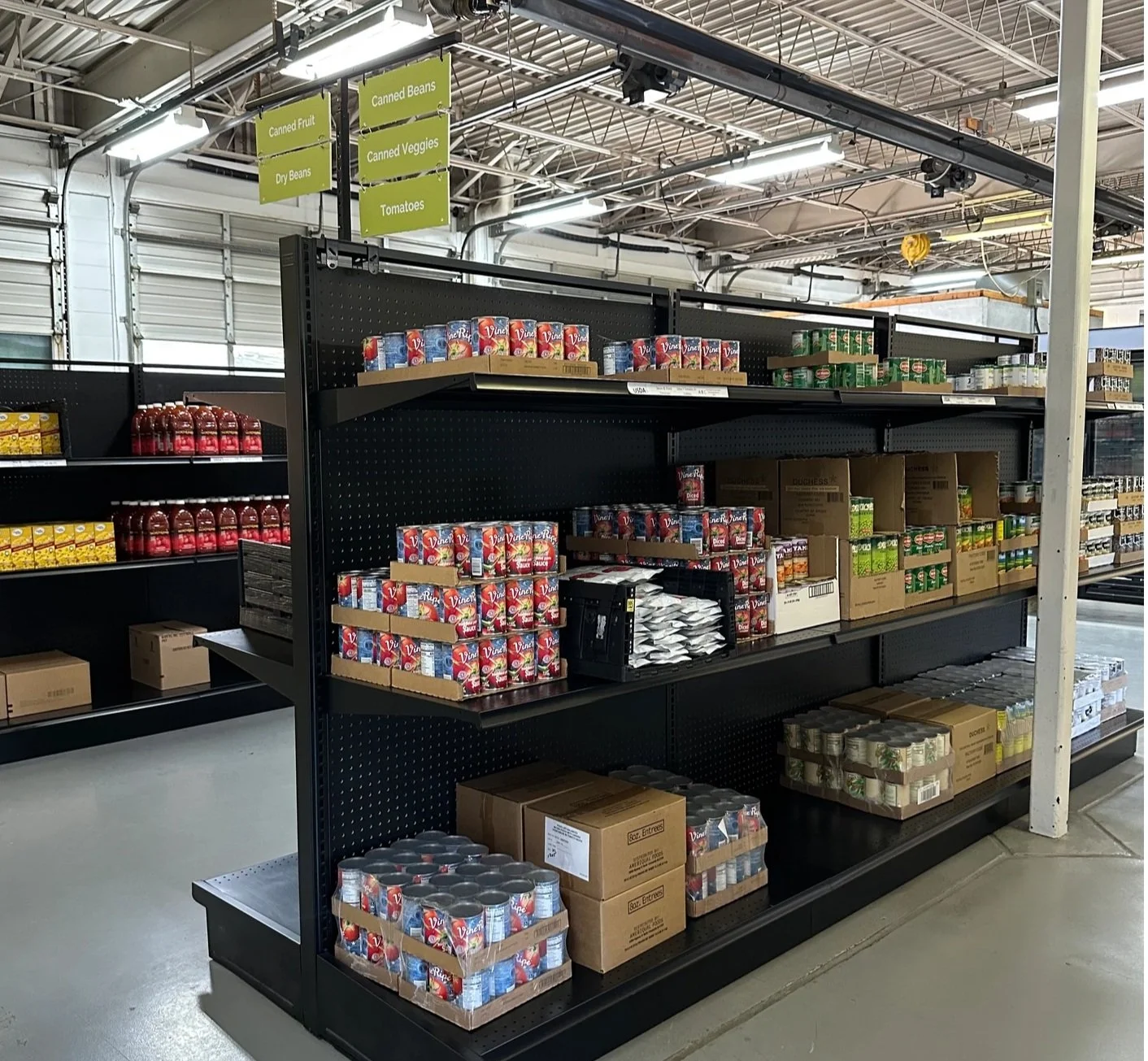
Neighborhood Grocery
Housing Support
Utilities Assistance
Governance and Scalability
And ensured the identity could scale across:
Print collateral
Email signatures
Merchandise
Digital platforms

The work positioned RARA as more than a pantry; as a community safety net.
The refreshed identity:
Expanded awareness beyond the food pantry
Strengthened donor understanding of full services
Reinforced dignity in client-facing communications
Created a unified visual system for long-term growth
