Anatomy of a Brand
Rockbridge Area Relief Association (RARA)
Storytelling Through Identity Design

More than a mark, a promise.
When the Rockbridge Area Relief Association approached a milestone year, leadership recognized a gap: the community knew RARA as a food pantry, but not as the region’s most comprehensive emergency assistance organization.
The task wasn’t to redesign a logo.
It was to reshape perception.
I partnered with RARA to create a refreshed identity that preserved a familiar, trusted name while highlighting its range of services.
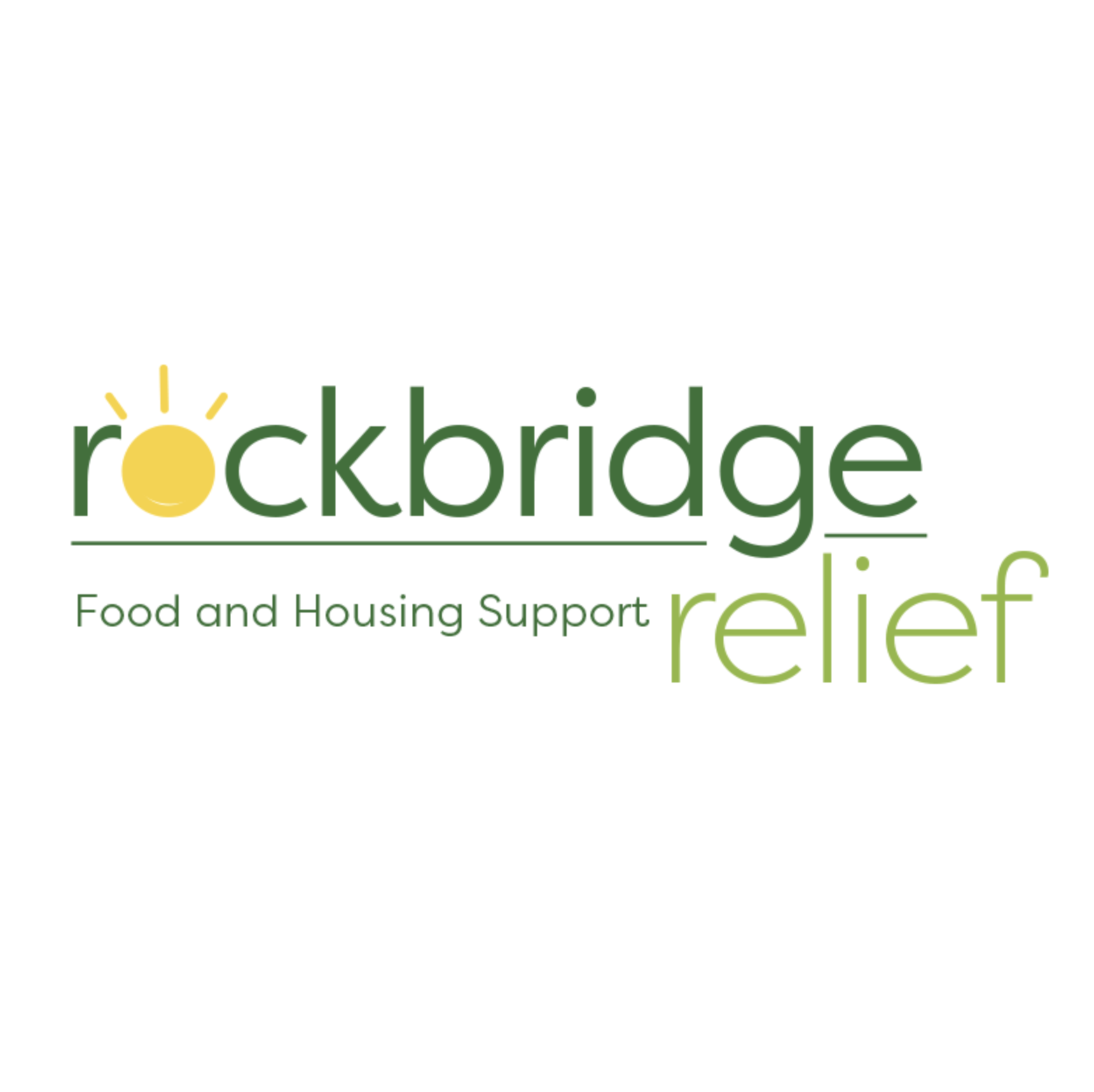
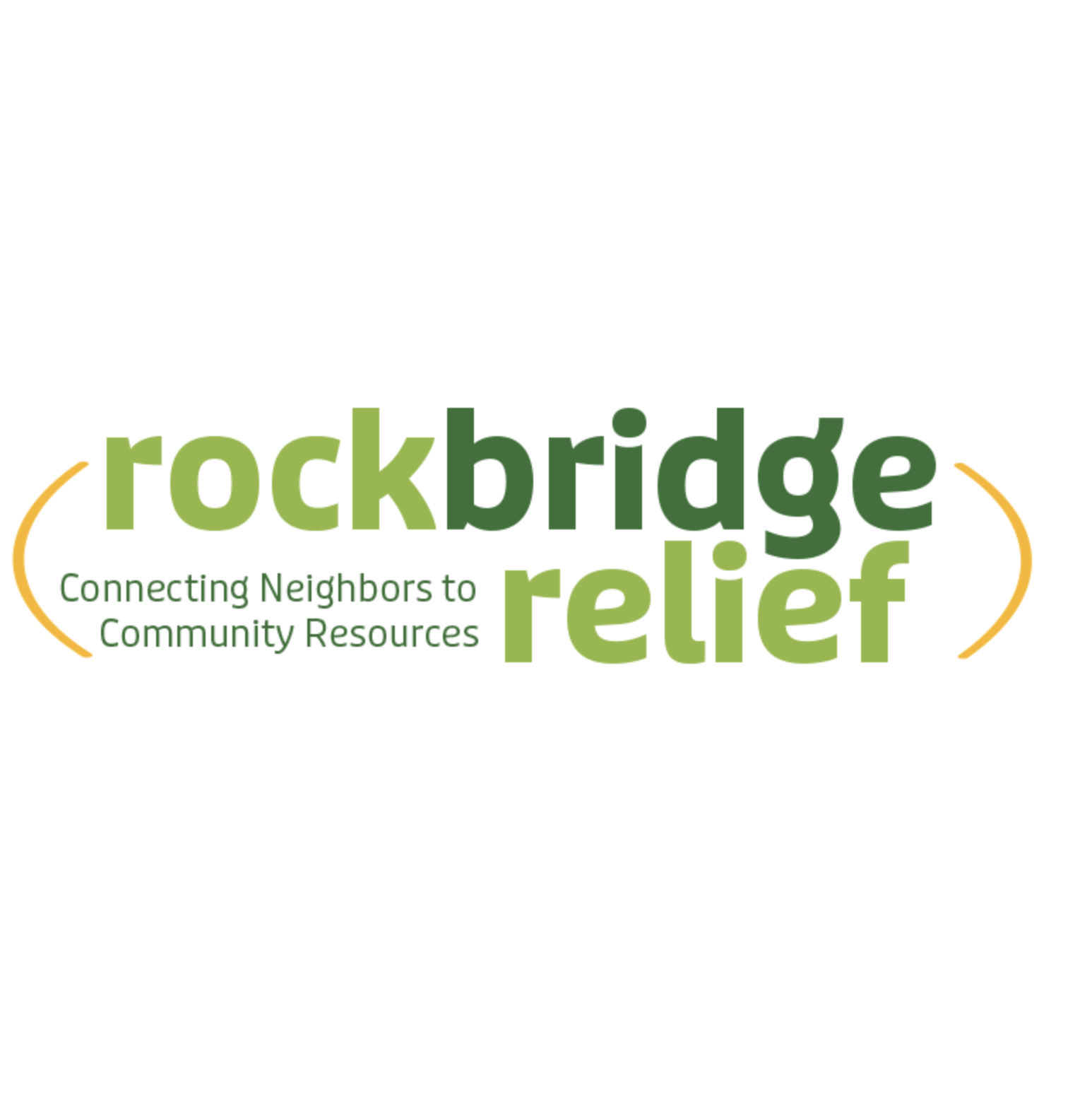
The Rockbridge Area Relief Association (RARA) has always been an important lifeline for people in need—but most folks in the community knew it primarily for its food pantry. This narrow perception overlooked RARA’s broader efforts, like providing housing and financial support to families.


Reflecting the Mission
I started by listening —holding multiple feedback sessions and exploring different design directions.
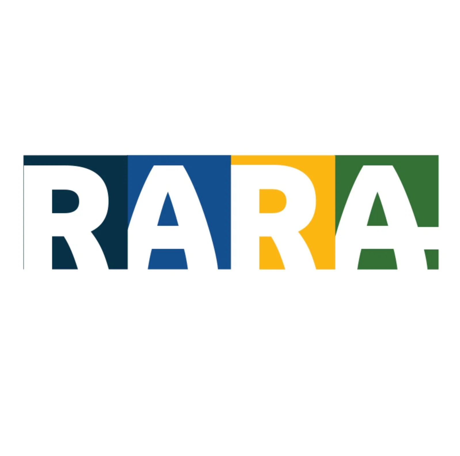
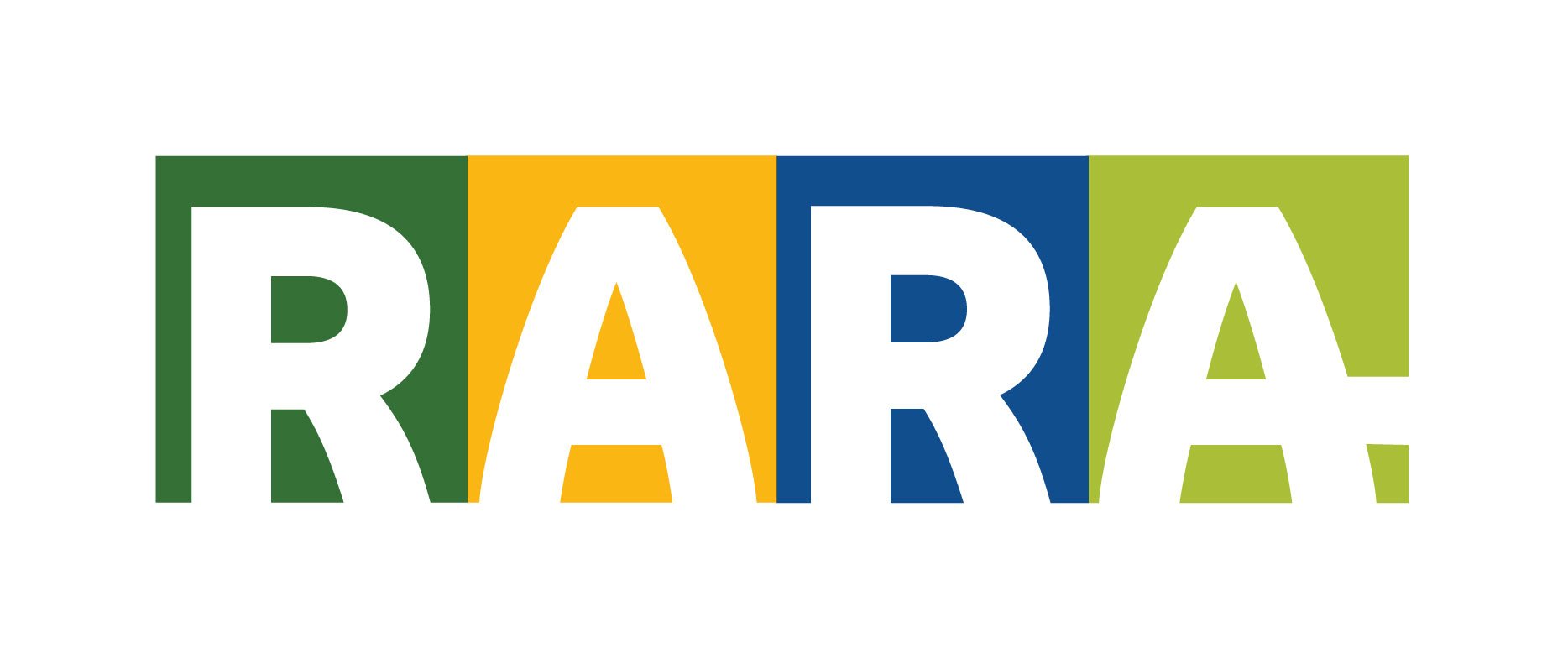
We arrived at a clear, meaningful identity that felt true to RARA’s roots but also spoke to its growth and inclusivity. The new logo was thoughtfully crafted, with letters closely aligned to symbolize community unity, and an extended crossbar on the final ‘A’ to visually communicate outreach and support.
-
Clearly showcased all of RARA’s offerings—not just food assistance, but housing, financial help, and community support.
-
Created simple, unified visuals and messaging that made it easier for people to recognize and connect with RARA across all communications.
-
By thoughtfully updating its brand while keeping the familiar name, RARA reinforced its trusted role in the community while signaling growth.
Nonprofit Brand Development
Rockbridge Area Relief Association
raralex.org
The Rockbridge Area Relief Association (RARA) has long been a lifeline for residents of Rockbridge County, offering critical housing, financial, and food assistance.
As the organization approached a milestone, leadership recognized the need for a refreshed identity that would reflect the full breadth of its mission and reintroduce RARA to the community in a meaningful way.
The Challenge: Bridging the Perception Gap
For many in the community, RARA was synonymous with its food pantry. While the pantry is a vital part of its work, this narrow perception overshadowed the organization’s broader mission of providing housing and financial support.
The challenge was to craft a rebrand that would:
Preserve RARA’s strong community ties.
Expand awareness of its comprehensive services.
Reflect its mission of providing diverse support to those in need.
The Approach: An Iterative and Collaborative Process
Research and Goal Setting
To better understand community perceptions and needs, I collaborated with RARA’s board and built on earlier research. Together, we defined clear goals for the rebrand:
Highlight the full scope of RARA’s services.
Retain the organization’s connection to the community by preserving its recognizable name.
Develop a versatile and mission-driven visual identity.
Designing the New Identity
The design process was intentionally collaborative and iterative, with multiple mockups and feedback sessions at each stage. This ensured the final identity aligned with the board’s vision while remaining grounded in RARA’s mission.
The final logo featured:
Tightly Arranged Letterforms: Representing unity and individuality.
Extended Crossbar on the Last ‘A’: A subtle nod to outreach, reinforcing RARA’s mission to support those in need.
In addition to the logo, I delivered a comprehensive brand guide that included visual elements, color palettes, and editorial style guidelines. This ensured consistent communication across all platforms and touchpoints.
The Solution: A Cohesive and Versatile Brand
The refreshed identity equipped RARA with the tools to communicate its mission effectively and holistically:
Expanded Awareness: The new brand emphasized RARA’s role beyond the food pantry, spotlighting its housing and financial assistance programs.
Cohesive Visual System: A unified design language strengthened RARA’s presence across platforms, from print to digital communications.
Community Connection: By preserving the familiar name, the rebrand maintained RARA’s strong ties to the local community while signaling growth and inclusivity.
A Fresh Start for a Vital Mission
The RARA rebrand successfully bridged the perception gap, offering a visual and strategic foundation that better reflected its mission and broadened community awareness. The new identity empowered RARA to continue its vital work with clarity and purpose by combining research, collaboration, and creative vision.
Results
The rebrand allowed RARA to:
Reintroduce itself to the community with a clear, unified identity.
Increase awareness of its comprehensive services, shifting perceptions beyond the food pantry.
Strengthen engagement with donors, volunteers, and community members through consistent and impactful communication.
